
In order to distance itself from disgraced founder Lance Armstrong and his scandals, the Livestrong Foundation unveiled a new logo. The new logo emphasizes the "foundation" and removes references to Lance Armstrong.
The designers of the new logo remained tied to the old logo by using the original same "LIVESTRONG". They could have used lower case letters to de-emphasize this. E.g. "LiveStrong". This would also make the "FOUNDATION" part stand out. They could also have added a tagline to reinforce the message of what they do and why they are still relevant without a relationship with Lance Armstrong. For example: "Helping Families with Cancer LiveStrong". Most importantly, they could have changed the bold emphasis to "live" instead of "strong" to reinforce the "living" message".
In explaining the new logo, the EVP of operations stated, "The positioning of the bars suggests forward and dynamic movement.". Brand logos are all about showing and not telling. If you have to explain your logo, it will be lost on the typical person. The best brand logos reinforce emotional connections to the audience. This does not happen when one has to explain those connections so people "get it".
| Out with the old: 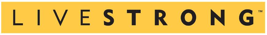 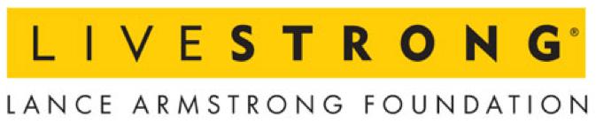 | In with the new: 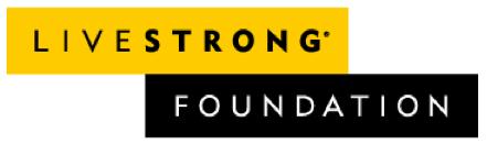 |
Mock ups of my recommendations:
| Place more emphasis on "FOUNDATION" by using lower case letters for "LiveStrong" in place of the old "LIVESTRONG" and adding a tagline to make even clearer exactly what it does: 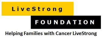 | Using a tagline with the new version would also provide a stronger emphasis on the "foundation" while making clearer exactly what it does: 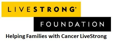 |
Source: "Livestrong Tweaks Logo To Move Past The Lance Armstrong Scandal", BusinessInsider, March 4, 2013.
http://www.businessinsider.com/livestrong-made-a-new-logo-2013-3
CKB Solutions is all about real solutions for the real world. To learn how we can help your business, contact Greg Kovacic in Hong Kong.
http://www.businessinsider.com/livestrong-made-a-new-logo-2013-3
CKB Solutions is all about real solutions for the real world. To learn how we can help your business, contact Greg Kovacic in Hong Kong.


 RSS Feed
